E-commerce
Tira Beauty
Tira Beauty
(2023-2024)
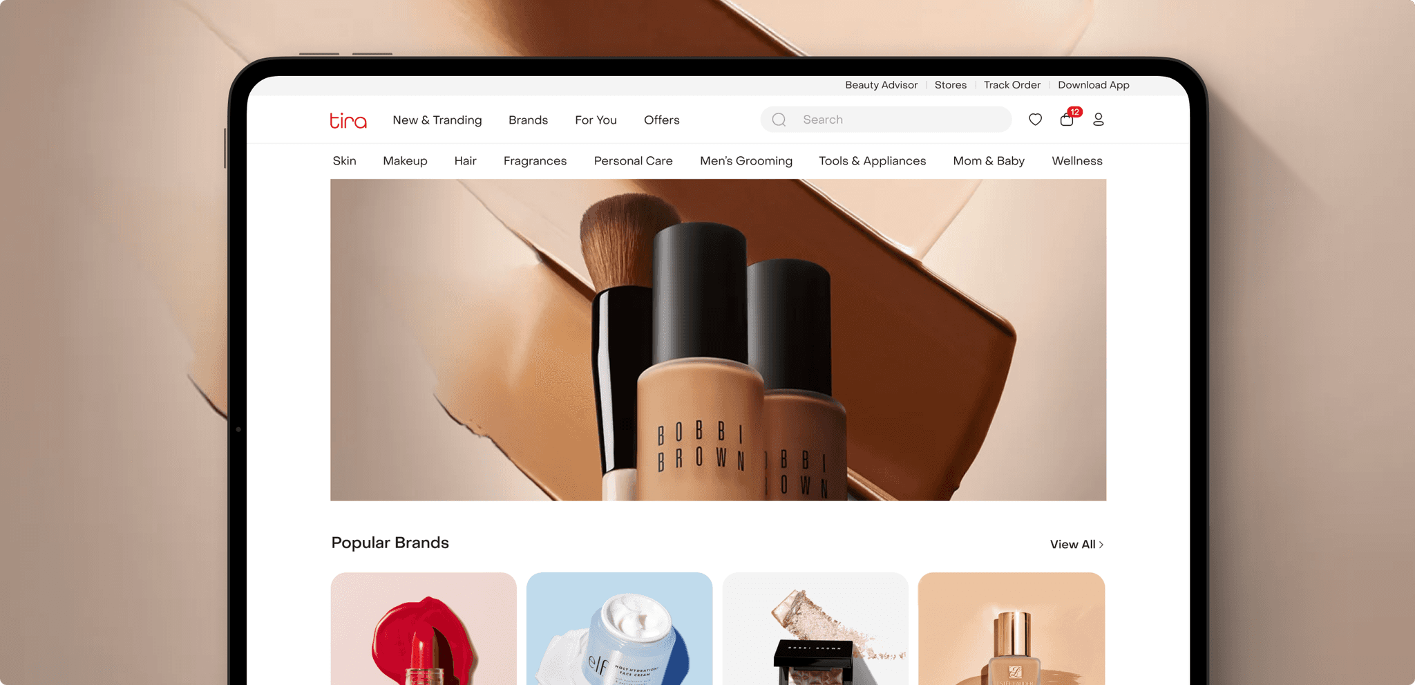
Designed Tira Beauty’s Landing page and checkout flow to make buying beauty products seamless, fast, and emotionally delightful
Web
B2C
Role
Ui Ux Designer
Services
Visual Design | Design system
Context
Tirabeauty is a beauty e-commerce brand focused on simplifying premium cosmetic shopping. The goal was to redesign the checkout experience to make it faster, more transparent, and emotionally resonant for users purchasing beauty products
Challenge
Today’s customers expect seamless payment experiences.
Checkout was the biggest drop-off point. The flow felt long, cluttered, and overwhelming.
Too many fields and unclear payment options created friction at the final step, causing users to abandon their purchase.
Approach
My goal was to make testing simple and clear.
• I designed the checkout as a 3-step guided flow (Cart → Delivery → Payment)
• Effortless address entry- smart autofill and PIN-based address detection.
• Clean visual hierarchy, real-time order summary, and subtle motion to confirm actions.

User Flow
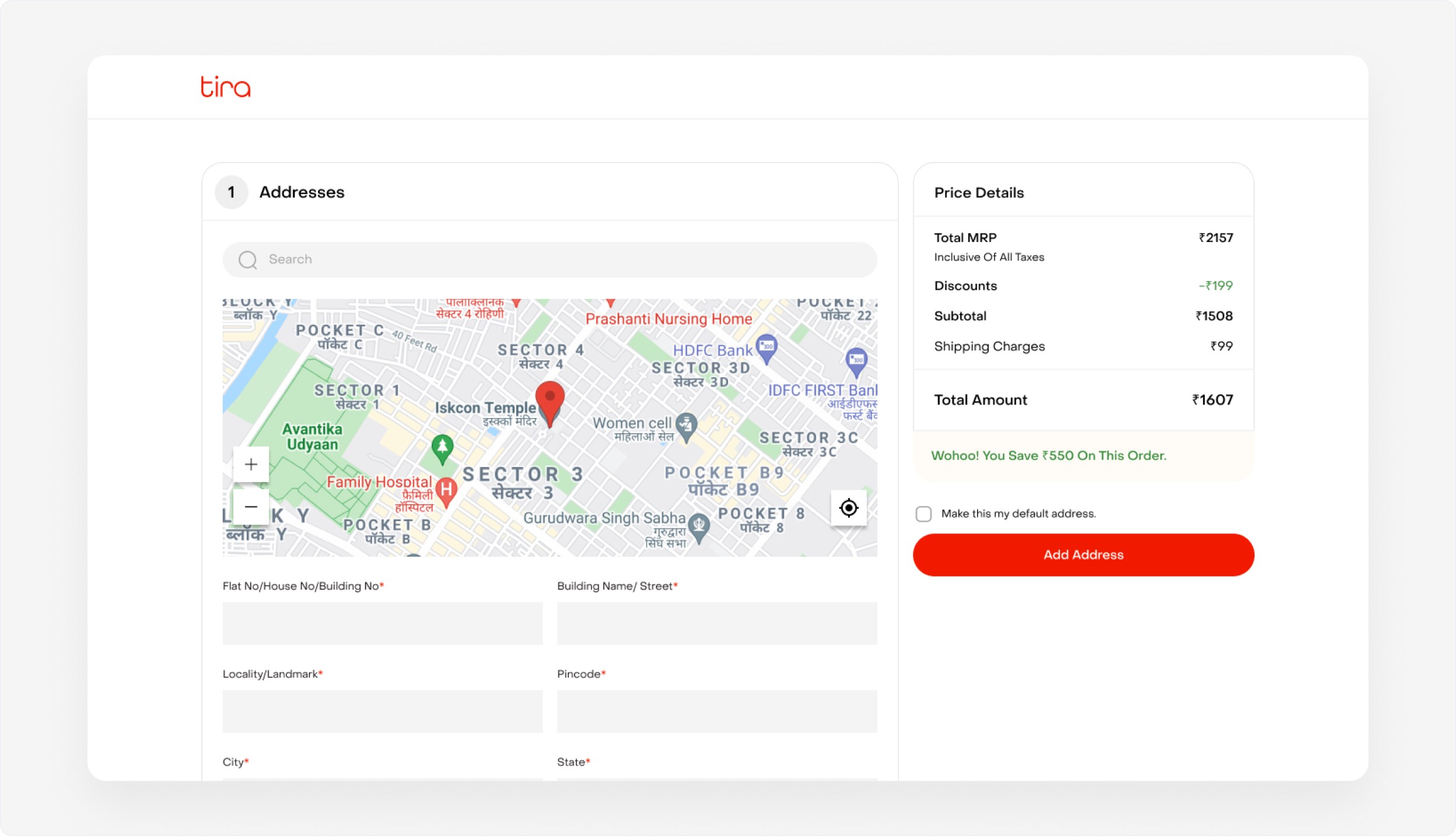
Pin location on the map
Reducing manual input and errors. Clear fields and a visible price summary
keep everything in context
Reducing manual input and errors. Clear fields and a visible price summary keep everything in context
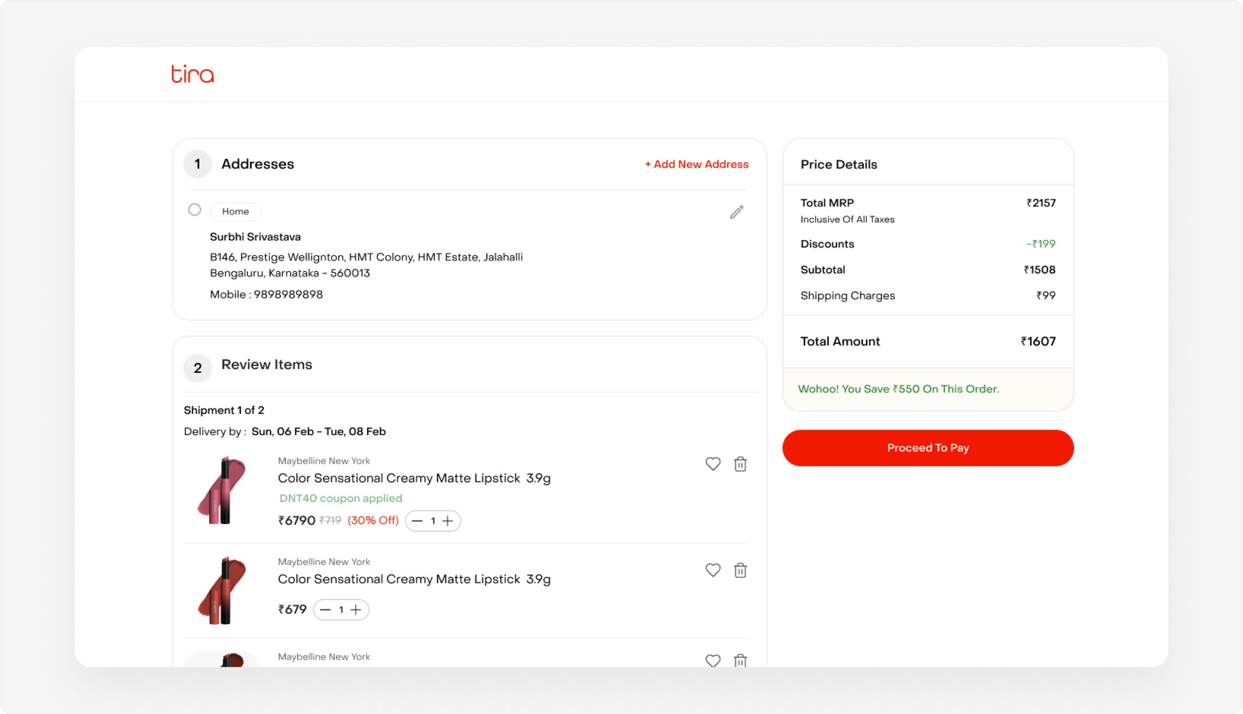
Quickly order summary
• Review items in one view
• Pricing details stay visible throughout, and a strong “Proceed to Pay” action keeps the
next step clear and frictionless
• Review items in one view
• Pricing details stay visible throughout, and a strong “Proceed to Pay”
action keeps the next step clear and frictionless
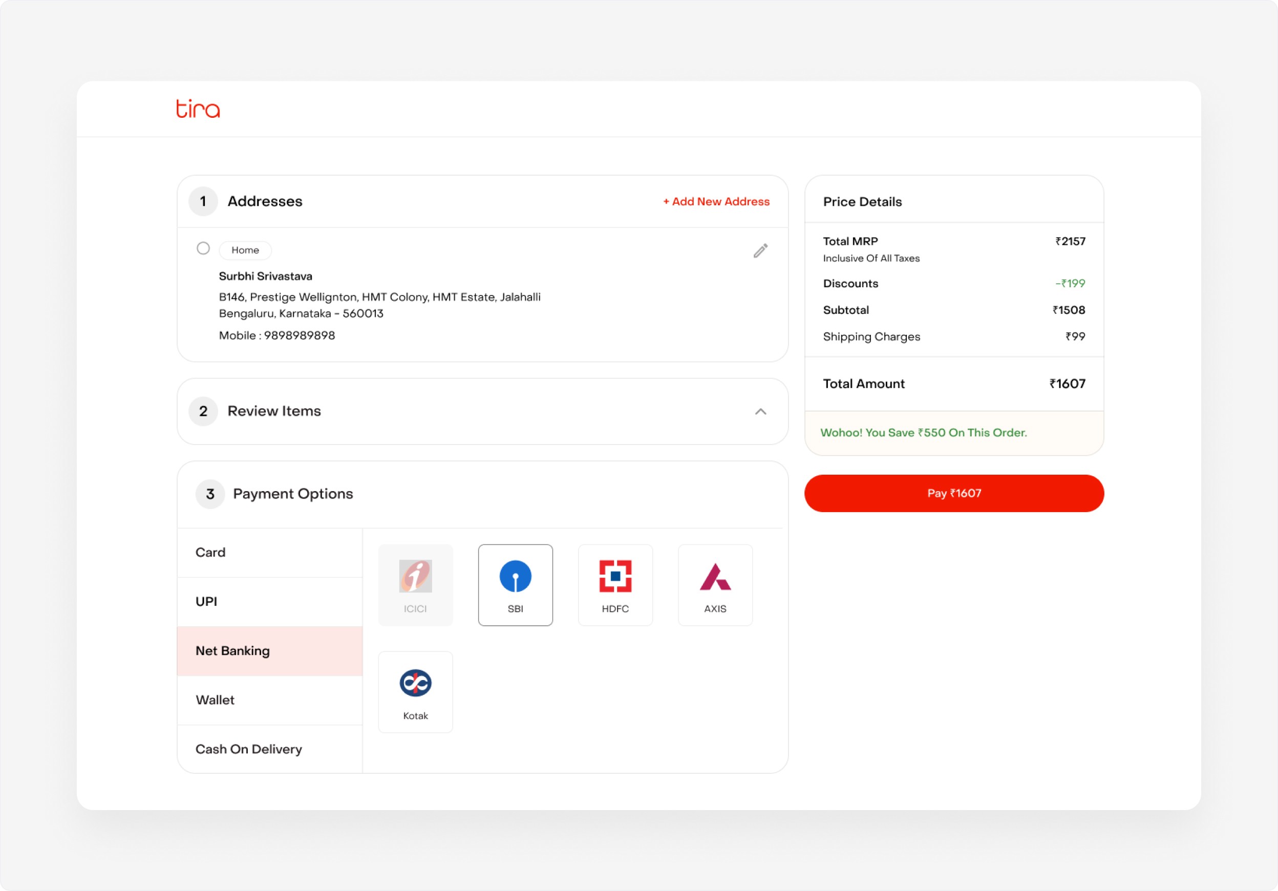
Consistent & Intuitive Payment
Following the same design pattern as the Customer Details screens.
This creates a familiar and consistent experience, helping users quickly find and select their preferred payment option.
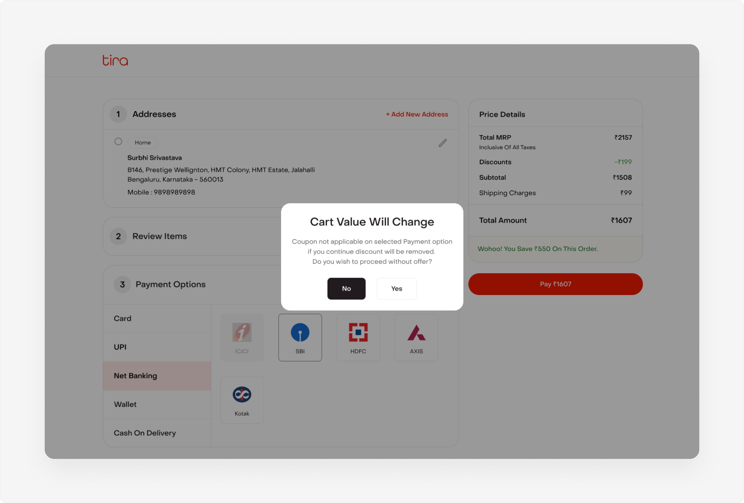
Handling payment errors with clarity
Thoughtfully designed error states help users recover from failed payments
with confidence. Clear messages explain what went wrong and guide users toward the next step
with minimal friction.
Thoughtfully designed error states help users recover from failed payments with confidence. Clear messages explain what went wrong and guide users toward the next step with minimal friction.
This flow cut cart abandonment by 28% and boosted checkout completion by 35%, making every purchase smoother, faster, and more delightful
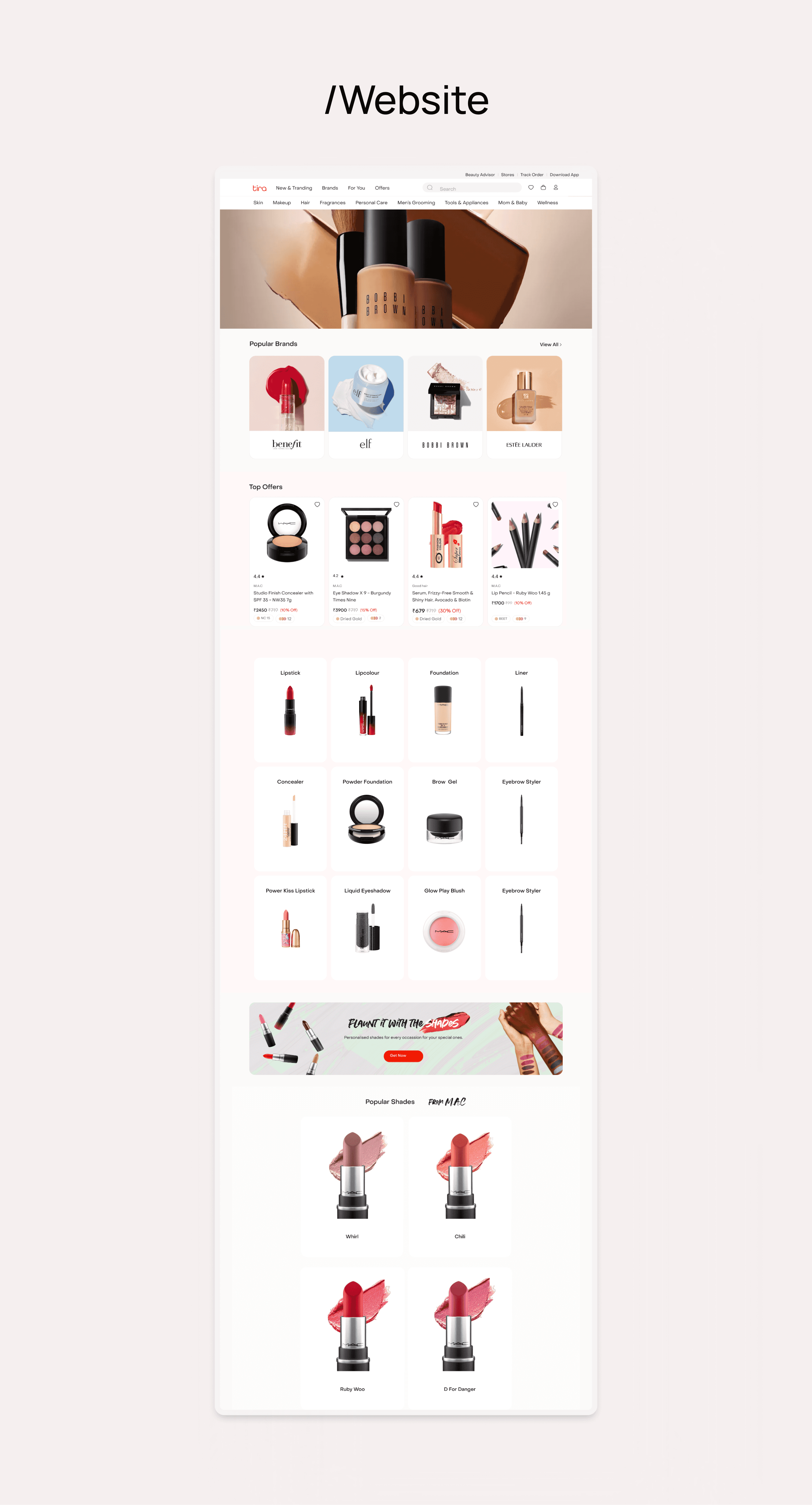
Designing a seamless, scalable, and
sensory-rich experience that bridges beauty, technology, and inclusivity.
UI Approach
A modern, clean aesthetic with soft pastels, strong editorial grids, and generous whitespace.
Consistent brand palette reflecting femininity, clarity, and calmness.
Modular UI components to support campaign flexibility and product scaling.
Emphasis on large visuals, tactile microinteractions, and custom iconography.
Visual Direction
Used imagery with diverse models to reflect inclusivity.
Integrated motion design and video content to communicate usage, texture, and results.
Balanced editorial-style layouts with commerce-first objectives.


E-commerce
Tira Beauty
(2023-2024)
Designed Tira Beauty’s Landing page and checkout flow to make buying beauty products seamless, fast, and emotionally delightful
Web
B2C
Role
Ui Ux Designer
Services
Visual Design | Design system
Context
Tirabeauty is a beauty e-commerce brand focused on simplifying premium cosmetic shopping. The goal was to redesign the checkout experience to make it faster, more transparent, and emotionally resonant for users purchasing beauty products
Challenge
Today’s customers expect seamless payment experiences.
Checkout was the biggest drop-off point. The flow felt long, cluttered, and overwhelming.
Too many fields and unclear payment options created friction at the final step, causing users to abandon their purchase.
Approach
My goal was to make testing simple and clear.
• I designed the checkout as a 3-step guided flow (Cart → Delivery → Payment)
• Effortless address entry- smart autofill and PIN-based address detection.
• Clean visual hierarchy, real-time order summary, and subtle motion to confirm actions.

User Flow
Pin location on the map
Reducing manual input and errors. Clear fields and a visible price summary keep everything in context
Quickly order summary
• Review items in one view
• Pricing details stay visible
throughout, and a strong
“Proceed to Pay” action keeps
the next step clear and
frictionless
Consistent & Intuitive Payment
Following the same design pattern as the Customer Details screens.
This creates a familiar and consistent experience, helping users quickly find and select their preferred payment option.
Handling payment errors with clarity
Thoughtfully designed error states help users recover from failed payments
with confidence. Clear messages explain what went wrong and guide users toward the next step
with minimal friction.
This flow cut cart abandonment by 28% and boosted checkout completion by 35%, making every purchase smoother, faster, and more delightful
Designing
a seamless, scalable, and sensory-rich experience that bridges beauty, technology, and inclusivity.
UI Approach
A modern, clean aesthetic with soft pastels, strong editorial grids, and generous whitespace.
Consistent brand palette reflecting femininity, clarity, and calmness.
Modular UI components to support campaign flexibility and product scaling.
Emphasis on large visuals, tactile microinteractions, and custom iconography.
Visual Direction
Used imagery with diverse models to reflect inclusivity.
Integrated motion design and video content to communicate usage, texture, and results.
Balanced editorial-style layouts with commerce-first objectives.